
Product Display Page Revamp
User research, UX exploration and UI designs for Harry’s Product Display Pages.
Timeline
April → May 2024
Team
Lead Designer, Product Manager, and Software Engineers
Role
Product Designer
Tools
Figma
at a glance
This project was part of my work at Harry’s, a modern consumer goods company specialising in men’s shaving and personal care products. Products are available at various retailers and on the website as subscriptions or one-time purchases.
The Product Display Page (PDP) is crucial for presenting product information concisely and persuasively. However, over time, iterative feature additions made the page cluttered and overwhelming for customers. The goal of this project was to gather consumer feedback and revamp the layout to enhance user experience and optimise conversions.
MY ROLE
I conducted user interviews and summarised the findings. Collaborating with the lead product designer, I contributed to the creation of low-fidelity prototypes and as the primary UI designer on the project, I translated these ideas into high-fidelity prototypes.
PROBLEM
The current PDP is cluttered with excessive information and options, creating unnecessary friction and reducing conversion rates. Whilst retaining product selectors and customisation options is crucial, the challenge was to present them in an easy-to-digest format. Key product information must be accessible without overwhelming the user.
design considerations
USER RESEARCH
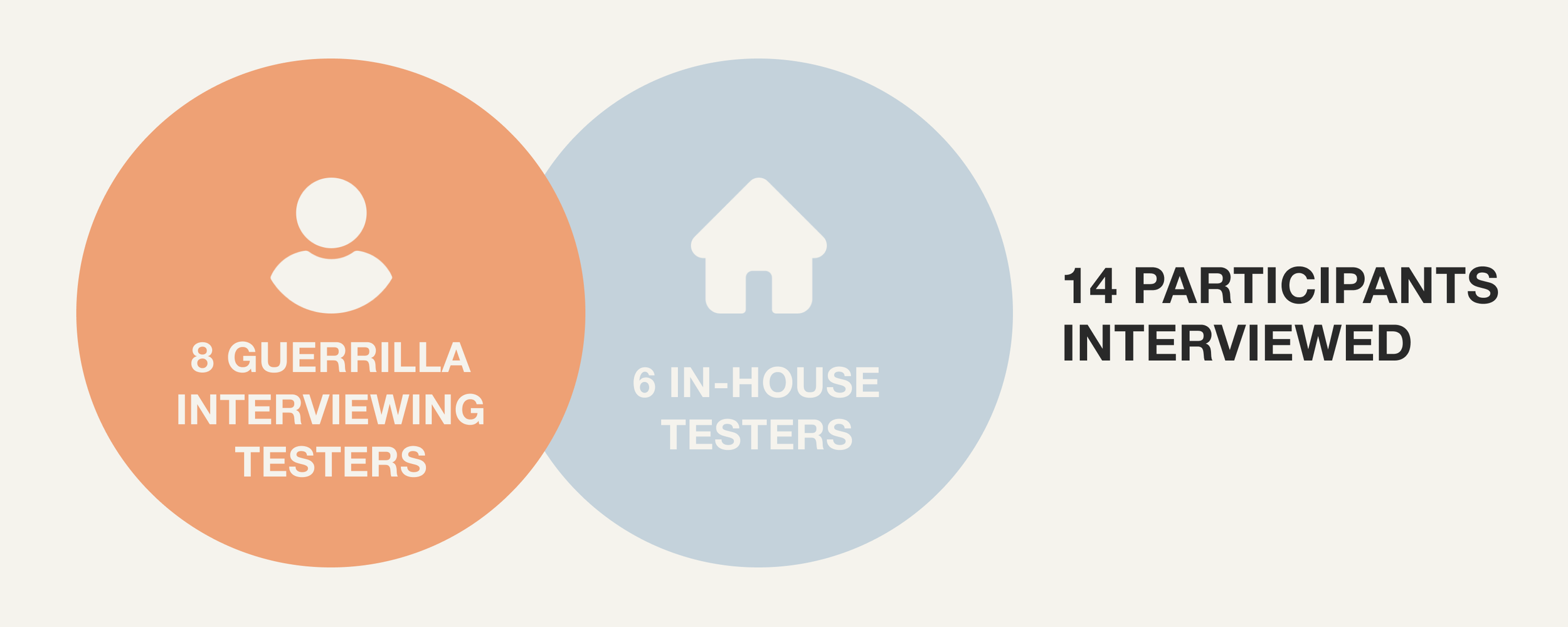
To identify improvement areas, myself along with 2 other product designers interviewed 14 users: 8 through guerrilla interviewing in public spaces and 6 in-house testers across various teams at Harry’s.
KEY FINDINGS
Users spent most of their time browsing images and skimming information rather than thoroughly reading descriptions.
Users focused on credentials, claims, ingredients, and key features, and expected this information to be clearly displayed.
Informational banners below the fold were frequently missed by users.
The subscription kit-up section was confusing and often frustrated users.
BUSINESS AND PRODUCT REQUIREMENTS
Design constraints included the need to:
Include an educational section detailing product benefits and a how-to-use section.
Provide a way for users to see which retailers carry the product.
Retain the option for customers to buy complementary products through an upsell section.
solution overview
low fidelity UX exploration
I collaborated with engineers and PMs to understand the technical constraints of the project, as well as with the lead product designer on the overall design direction.
*Click on image to expand
high fidelity UI exploration
DECISION 1: CLAIMS AND PRODUCT DETAILS
Claims are presented as bite-sized, digestible pieces of information to ensure users can quickly grasp the product's key benefits.
CONSIDERATIONS
Scalability of Claims: The layout has to remain visually appealing even if more claims are added in the future.
Collapsible Information: A collapsible accordion for "how to use" instructions was implemented to reduce visual clutter while retaining the option for users seeking detailed information.
DECISION 2: IMAGE LAYOUT AND ZOOM
The new design allowed for more space for product images, making the page look more visually dynamic overall.
CONSIDERATION
Image Count: While a fallback option for displaying 3 images would be made available, maintaining 5 images per SKU was preferred for a richer visual experience. An odd number of images was preferred as even numbers left too much white space on the design.
DECISION 3: RETAIL AVAILABILITY
As direct-to-consumer (DTC) sales and subscriptions make up a greater proportion of the company’s profits, the PDP should display retail availability of products while minimising users switching directly to retailers.
Decision An accordion containing retailer logos, collapsed by default, was introduced. This maintains visibility without disrupting the logical hierarchy or making the retailer option too prominent.
DECISION 4: SUBSCRIPTION EDUCATION PIECE
Given the significant revenue driven by subscriptions, it was crucial to include an educational piece to highlight this option.
CONSIDERATION
Balancing Visual Clutter: Displaying subscription benefits prominently could create visual clutter and detract from product information, potentially causing friction in the purchase process.
Decision A tooltip was chosen to provide additional context about subscription options without overwhelming users.
DECISION 5: BELOW-THE-FOLD ELEMENTS
The initial stage of A/B testing focused only on above-the-fold elements, but potential enhancements for below-the-fold elements were also considered to increase page engagement, average order value (AOV) and conversion rates.
Product Upsells Upsells could be displayed more attractively, such as showcasing products as part of a routine, similar to The Ordinary’s website. Mimicking familiar elements from popular retailers like Amazon’s product builder function could also encourage additional purchases.
Customer Testimonials Including customer testimonials and ratings can significantly boost trust and conversion rates. Research shows that 92% of consumers trust word-of-mouth recommendations, and 79% trust online reviews as much as personal recommendations.
FAQs Adding an FAQ section provides further clarification for users before making a decision.
projected impact
Although the project has not been implemented, it is projected that the changes will increase conversion rates by 5%, leading to a potential £30K increase in revenue.
The projections and decisions taken were grounded in user research and aligned with product requirements from both the brand and product teams. An appropriate next step would be to validate the choices through A/B testing and against further usability testing.
Future iterations will focus on refining below-the-fold elements by incorporating curated upsells, customer testimonials, and an FAQ section.
key takeaways
Seek Feedback and Seek It Out Early
Engaging with users and stakeholders early in the process helped us identify pain points and opportunities that informed our design decisions, minimising the bias that we would’ve otherwise had as designers. Early feedback from PMs and brand teams also ensures that the design evolves in the right direction.
Managing Stakeholder Expectations
Throughout this project, I learned the importance of effectively communicating design rationale and advocating for user-centred design principles. For instance, brand teams may find it tempting to push for more information to be added to the page, however, early user tests showed that text was often overlooked by users. Finding a middle ground helped in fostering a collaborative environment and ensuring that business goals were also met.